The Braindead "Browse For Folder" dialog
[Update: Just found out that I'm not the only one who hates this stupid dialog]
I'm getting really mad at that braindead "Browse For Folder" dialog box which many applications seem to like using. I guess the dialog is really a Microsoft invention supposed to make life easier for braindead users. Maybe it does for them, but I doubt it. Anyway, for any normal person, it only makes it extremely difficult to create a new folder. What is particularly disheartening is that it seems to be mainly the open source apps which use it.
This example shows the dialog when installing Firefox. But I have had to endure it with many other apps.
So, let's say I would like firefox installed in D:\firefox instead of C:\Program Files\Firefox. I click on "Browse..." and what I expect is having a choice of browsing to there, or just typing or pasting into an edit box, which is usually much faster and easier.
When I click "Browse...", I see something like this (well, not really; but you don't need to see my Program Files folder):
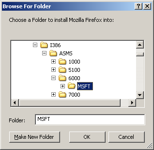
So instead of painfully clicking my way through the maze of disks and folders while trying to avoid the traps of all the stupid virtual folders which Windows helpfully scattered around, I just type ahead into the edit box ...
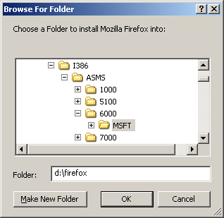
... and press enter.
Well, guess where Firefox is about to install itself:
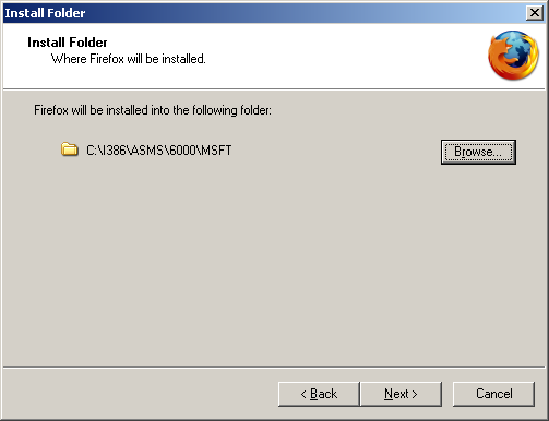
Was this supposed to be "user-friendly" and "intuitive"? I have only one explanation: the developers expect me to be too stupid to use my keyboard, and think it's better if they ignore the random characters I could accidentally have typed when putting my beer on the keyboard (what is a keyboard anyway? some legacy device from before Apple invented mice?) ...
I'm getting really mad at that braindead "Browse For Folder" dialog box which many applications seem to like using. I guess the dialog is really a Microsoft invention supposed to make life easier for braindead users. Maybe it does for them, but I doubt it. Anyway, for any normal person, it only makes it extremely difficult to create a new folder. What is particularly disheartening is that it seems to be mainly the open source apps which use it.
This example shows the dialog when installing Firefox. But I have had to endure it with many other apps.
So, let's say I would like firefox installed in D:\firefox instead of C:\Program Files\Firefox. I click on "Browse..." and what I expect is having a choice of browsing to there, or just typing or pasting into an edit box, which is usually much faster and easier.
When I click "Browse...", I see something like this (well, not really; but you don't need to see my Program Files folder):

So instead of painfully clicking my way through the maze of disks and folders while trying to avoid the traps of all the stupid virtual folders which Windows helpfully scattered around, I just type ahead into the edit box ...

... and press enter.
Well, guess where Firefox is about to install itself:

Was this supposed to be "user-friendly" and "intuitive"? I have only one explanation: the developers expect me to be too stupid to use my keyboard, and think it's better if they ignore the random characters I could accidentally have typed when putting my beer on the keyboard (what is a keyboard anyway? some legacy device from before Apple invented mice?) ...

1 Comments:
Glad to read I'm not alone ;-)
Post a Comment
<< Home